Tuesday, 7 October 2014

Visual Culture Level 5 - Targeting the Youth Market / Sgt. Pepper's Lonely Hearts Club Band

Sgt. Pepper’s Lonely Hearts Club Band is an album by The Beatles and the cover art was designed by Peter Blake and Jann Haworth from a drawing by Paul McCartney. It was photographed by Michael Cooper and it included a collage of The Beatles in costumes as the Sgt. Pepper's Lonely Hearts Club Band and they were stood with cardboard cut outs of various famous people. There are also 4 wax modles of the "old" beatles stood next to them, to create a contrast of the old style and their new style. Their mustaches represent the influence of the hippie trend and they are stood behind a drum skin bearing the name of the album created by Joe Ephgrave. The concept for the album cover was "people we like" and that explains the mass of famous people in the background. There was a big question about why Elvis didn't appear on the cover and when Paul McCartney was asked this he replied "Elvis was too important and too far above the rest even to mention ... so we didn't put him on the list because he was more than merely a ... pop singer, he was Elvis the King".


http://www.neatorama.com/2012/04/05/the-cover-art-of-sgt-peppers-llonely-hearts-club-band/

Monday, 6 October 2014

Visual Culture Level 5 - Golden Age of Illustration / Chris Riddell

Chris Riddell was born in Cape Town, South Africa in 1962 and then moved to England in 1963. From 1981 to 1984 he studied illustration at Brighton Polytechnic, where he was taught by the illustrator of ''When the Wind Blows'', Raymond Briggs. Chris Riddell labels Raymond as a huge influence on his work and Briggs introduced him to a publisher and Chris was then commissioned to illustrate ''The Book of Giants for Sainsbury's''.

''From 1981 to 1984 he studied illustration at Brighton Polytechnic, where he was taught by Raymond Briggs, the children's illustrator whose first political book, When the Wind Blows, appeared in 1982. Riddell acknowledges him as a "huge influence" on his work. Briggs introduced him to his own publisher, and, while still a student, Riddell was commissioned to illustrate The Book of Giants for Sainsbury’s. It appeared in 1985.'' [1]

In 1988 Riddell was hired by the editor of the Economist to illustrate the articles of the magazine. He got a job as a political cartoonist for the Sunday Correspondent and he was also a business cartoonist for the Observer.  

'' In 1989 Riddell got his first job as political cartoonist, for the short-lived Sunday Correspondent, and from 1990 to 1991 he was also business cartoonist on the Observer, producing illustrations for the personal finance pages.'' [2]

Riddell has a few influences such as Ernest Shepard [3], John Tenniel [4], and William Heath Robinson. Riddell really loves Heath Robinsons illustrations for Professor Branestawm. [5] He also likes black and white book illustrations and I think this influence can be seen throughout his work and then he started to experiment with colour when he was working for the Observer. 

''"I particularly loved his illustrations for Professor Branestawm" - as well as the black and white book illustrators of the nineteenth and early twentieth centuries. Although a lover of black and white, Riddell successfully managed the transition to colour at the Observer, despite poor colour registration in the early days.'' [6]

Riddell has also illustrated covers for Punch, Economist, New Statesman and Literary review along side a massive selection of childrens books such as The Wish Factory, Goth Girl and the Ottoline Cat series. 

''Riddell has drawn covers for Punch, Economist, New Statesman and Literary Review. He has also written and illustrated a large number of very successful children's books.'' [7]


[1] UNKNOWN. Biography: Chris Riddell http://www.cartoons.ac.uk/artists/chrisriddell/biography (07.10.2014)

[2] UNKNOWN. Biography: Chris Riddell http://www.cartoons.ac.uk/artists/chrisriddell/biography (07.10.2014)


[3]


[4]


[5]


[6] UNKNOWN. Biography: Chris Riddell http://www.cartoons.ac.uk/artists/chrisriddell/biography (07.10.2014)

[7] UNKNOWN. Biography: Chris Riddell http://www.cartoons.ac.uk/artists/chrisriddell/biography (07.10.2014)


I notice that all of the information in the post is from the same website but the information on the website was from a selection of sources. The site had a bibliography at the bottom and I will insert the references below. I am not sure which quote matches to which reference as the website does not state this. 


  • John Sweeney "Rats, Pigs and other Political Animals", Observer, 2 July 1995, p.4.
  • Jack O'Sullivan "Can you recognise this man?", Independent, 12 May 1997, p.6.
  • Chris Riddell "Blair's first birthday: 5: Drawing Tony Blair", Observer, 26 April 1998, p.27.
  • "Chris Riddell honours the life and work of Chic Jacob", Observer, 17 September 2000, p.30.
  • Mark Bryant Dictionary of Twentieth-Century British Cartoonists and Caricaturists (Ashgate, Aldershot, 2000), pp.184-6.
  • "Background on Chris Riddell" 8 July 2005 -www.carnegiegreenaway.org.uk/pressdesk/press.php?release=pres_green_bg_0405.html
  • Phil Hogan “CARTOONS: Drawn, quartered... and now hung”, The Observer, 27 January 2008, Review p.6.
  • Vanessa Thorpe “Television satirists struggle to iden-tify targets in the kingdom of the bland”, The Observer, 18 April 2010, p.24.
  • "Chris Riddell creates Little Clegg Riding Hood" [video in which Chris Riddell explains - and is shown drawing - his cartoon for 4 July 2010 (BCA catalogue 81401)] www.guardian.co.uk/global/video/2010/jul/18/nickclegg

Visual Culture Level 5 - Golden Age of Illustration / Dave McKean

Dave McKean

"I think in narratives, or at least, sequences of images, so storytelling suits me. Comics allow me complete control and freedom of the work, and I don't need a budget to initiate a project, just a pencil and paper. It's a wonderfully democratic medium." - Dave McKean [1]

Dave McKean is an illustrator from Kent, his practice ranges from Comic Books to Photography and Illustration. As a young child he was always interested in Comic Books and they helped him understand sequence and framing and still to this day his connection with this medium is sting strong. Dave worked for DC Comics during his early career and his work was considered to be spatial, textural and conceptual, this can be seen in his Sandman cover [2]. Even if he is working on a CD cover or a series for a narrative he is always engaged in his work and enjoys the control. He works on a lot of commercial briefs which requires working with others and this helps him communicate with other people and create contacts and connections for the future. He even collaborated with Heston Blumenthal where he captures the recipes in ''an abstract way''

''Unexpected challenges are welcome ones, such as the collaboration with food write and celebrity chef Heston Blumenthal where he was ''able to capture the feeling of recipes in an abstract way.''[3].

Dave creates dark metaphorical work which the audience can immediately have thoughts and feelings about. He doesn't enjoy creating work that is hard to figure out, he thinks it is better if the image /s are self explanatory and he thinks his artwork from 'Cages' is an excellent example of this. The cat in the image is wearing a mask and the meaning behind it is that when you look at a cat you almost expect it to speak;

''The cat with a mask is an example of this. It has it's antecedents in Roman and Greek statuses. But I think anyone who has lived with a cat recognises that feeling of looking into a cat's eyes and expecting them to speak. There seems to be a real understanding there. A secret knowledge.'' [4]

He uses a mixture of techniques, mostly as experimentation to see what works best for what he's trying to do. In his work you can see glimpses of drawing, painting, photography, and 3D forms. 

 ''No material is out of bounds; he has even used cuttings from his beard mixed with treacle.''[5]

As part of his developing process he started to work with Mac computers to enhance aesthetics of his pieces. His work shows influences from artists he admires; he admires the line work of Egon Schiele [6], the intensity of Marshall Arisman [7], the disturbing iconic characters of Stasys [8] and film makers such as Tarkovsky. [9]


[1] Brezell, D & Davies, J. (2011) Making Great Illustration. A & C Black. London. p.137

[2]


[3] Brezell, D & Davies, J. (2011) Making Great Illustration. A & C Black. London. p.138

[4] Brezell, D & Davies, J. (2011) Making Great Illustration. A & C Black. London. p.138

[5] Brezel, D & Davies, J. (2011) Making Great Illustration. A & C Black. London. p.p 138-139

[6]


[7]


[8]


[9] Brezel, D & Davies, J. (2011) Making Great Illustration. A & C Black. London. p. 139


Visual Culture Level 5 - Material Culture as National Identity / Blade Runner

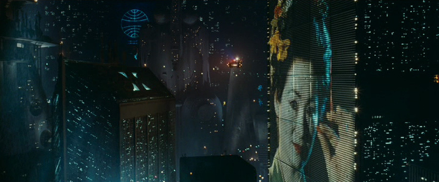
Japan is very well known for it's culture and we can see how this has influenced modern art forms in the film Blade Runner. The film is set in the future in America but we can clearly see some Japanese cultural influences which I will show below. The whole film is packed with Eastern influences, ranging from the text and language, the advertising signs, the oriental food choices, the bright neon lights of the city, the large and tall buildings, references to the Geisha, Eastern fashion references, objects such as the Wagasa. 


Cultural reference: Type face on the side of the bus, the Asian womans head wear and the wagasa (umbrella) in the foreground. 


Cultural reference: The advertisements on the streets, the tall buildings and the language of the text.

Cultural reference: The cultural reference is pretty obvious here with the large image of the Geisha on the side of the large industrial building.


Cultural reference: Oriental foods, the fact he is using chopsticks, the style of the bottles on the right of the image.